 Posts
Posts


The Design
There are two projects included in the design of the Silverlight Blog. The first project is a WCF Service for saving and retrieving the blog data. This is the model side of our MVVM architecture (Model View ViewModel). The blog data is saved in an XML file for simplicity. All BlogItems are retrieved and saved through theIBlogStoreService. Because the calls are asynchronous in nature, there are two pairs of calls on the service. BeginAddBlogItem, EndAddBlogItem, BeginGetAllBlogData, EndGetAllBlogData. (When it comes to calling anything outside Silverlight whether its a WCF service, a Rest Service or an API, you can bet that the call you make in Silverlight needs to be asynchronous, so you will always work in method pairs.) We'll see how we use these asynchronous calls in Silverlight in a little bit.
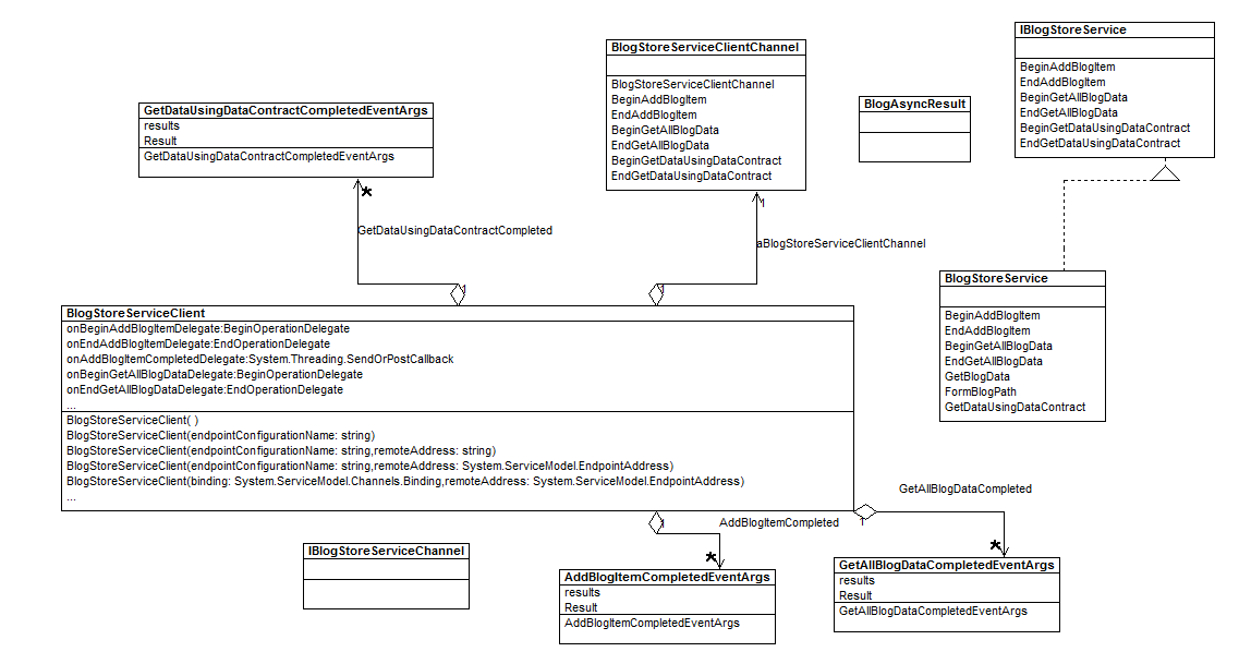
Figure 2 - The WCF Server Design Reverse Engineered with WithClass 2000
On the client side, we have one page, our Main.xaml page where our blog application resides. This is the View part of our MVVM architecture (Model View ViewModel). The View separates out all presentation concerns from the rest of our architecture. These concerns include color, layout, animation, fonts, etc. We also have a ViewModel as part of our MVVM architecture (Model View ViewModel) that binds to the xaml view. The ViewModel consists of a BlogManager and a BlogItem class. The BlogManager contains an ObservableCollection of all the BlogItems. The BlogManager and its items are bound to an ItemsControl that displays each blog item. Also in the client Design is an ICommand implementation for adding a blog item called AddBlogCommand. The ICommand is bound to the click of the blogging button.
Finally we have the BlogModel class to wrap the functionality to the Model which is basically the WCF Service.
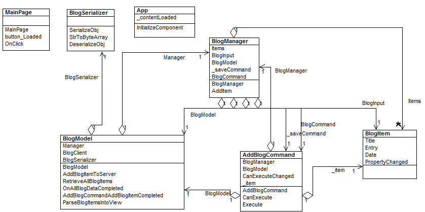
Figure 3 - The Silverlight Client Design (Reverse Engineered with WithClass 2000
The XAML
The XAML for the blogging app is shown in Listing 1. Here you can see the bindings for the ViewModel. For example the input fields for the blog are bound to theBlogInput inside the BlogManager. The ItemSource for the Blog's ItemsControl is Items inside the BlogManager and each BlogItem in Items binds to theBlogEntryTemplate DataTemplate.
Listing 1 - The XAML Presentation for the Blog
<Grid x:Name="LayoutRoot" Background="Lavender"> <Grid.RowDefinitions> <RowDefinition Height="Auto" /> <RowDefinition Height="*" /> </Grid.RowDefinitions> <ScrollViewer Height="500" > <ItemsControl ItemsSource="{Binding Items}" ItemTemplate="{StaticResource BlogEntryTemplate}" HorizontalAlignment="Center" > <ItemsControl.ItemsPanel> <ItemsPanelTemplate> <StackPanel Orientation="Vertical" /> </ItemsPanelTemplate> </ItemsControl.ItemsPanel> </ItemsControl> </ScrollViewer> <Grid Grid.Row="1" x:Name="BlogInput" > <Grid.Background> <LinearGradientBrush EndPoint="0.5,1" StartPoint="0.5,0"> <GradientStop Color="#FFDBE0EF" Offset="0"/> <GradientStop Color="#FF3E58AB" Offset="1"/> </LinearGradientBrush> </Grid.Background> <Grid.RowDefinitions> <RowDefinition Height="68*" /> <RowDefinition Height="150*" /> <RowDefinition Height="109*" /> </Grid.RowDefinitions> <Grid.ColumnDefinitions> <ColumnDefinition Width="0.228*" /> <ColumnDefinition Width="0.494*" /> <ColumnDefinition Width="0.279*"/> </Grid.ColumnDefinitions> <TextBlock Grid.Row="0" Text="Title" d:LayoutOverrides="Height" HorizontalAlignment="Right" VerticalAlignment="Center" FontSize="14.667" FontWeight="Bold" Margin="0,0,10,0" /> <TextBlock Grid.Row="1" Text="Blog Entry" HorizontalAlignment="Right" VerticalAlignment="Center" FontWeight="Bold" FontSize="14.667"Margin="0,0,10,0" /> <TextBox Grid.Column="1" x:Name="TitleTextBox" Height="30" HorizontalAlignment="Stretch" Text="{Binding BlogInput.Title, Mode=TwoWay}"Margin="0,0,10,0" /> <TextBox x:Name="BlogEntryTextBox" HorizontalAlignment="Stretch" Grid.Column="1" Grid.Row="1" AcceptsReturn="True" TextWrapping="Wrap" Text="{Binding BlogInput.Entry, Mode=TwoWay}"/> <Button x:Name="button" Grid.Row="2" Content="Blog It" Height="40" Width="100" Command="{Binding BlogCommand}" CommandParameter="{Binding BlogInput}" Grid.Column="1" HorizontalAlignment="Right" Loaded="button_Loaded" Click="OnClick" /> </Grid> </Grid> |
The DataTemplate (Listing 2), binds to an BlogItem in the Items collection much like the BlogInput binds to the input section of the blog. This makes sense since the input is carrying the same information as the blog entry.
Listing 2 - Blog Item Data Template
DataTemplate x:Key="BlogEntryTemplate"> <Grid d:DesignWidth="343" d:DesignHeight="103" RenderTransformOrigin="0.816,0.553" Width="648" Background="#FF3E58AB"> <Grid.RowDefinitions> <RowDefinition/> <RowDefinition/> <RowDefinition/> </Grid.RowDefinitions> <Grid.ColumnDefinitions> <ColumnDefinition /> </Grid.ColumnDefinitions> <Grid Grid.ColumnSpan="2" Margin="20,0,0,0" VerticalAlignment="Top" d:LayoutOverrides="Width"> <Grid.ColumnDefinitions> <ColumnDefinition Width="448" /> <ColumnDefinition MinWidth="180" /> </Grid.ColumnDefinitions> <TextBlock x:Name="Title" Text="{Binding Title}" Foreground="#FFF3EFEF" HorizontalAlignment="Left" VerticalAlignment="Top" FontWeight="Bold" FontSize="21.333" Margin="20" TextWrapping="Wrap"> <TextBlock.Effect> <DropShadowEffect/> </TextBlock.Effect> </TextBlock> <TextBlock Grid.Column="1" x:Name="Date" Text="{Binding Date}" Foreground="#FFF7F1F1" Height="40" VerticalAlignment="Top" HorizontalAlignment="Left" d:LayoutOverrides="HorizontalAlignment" Margin="5" /> </Grid> <TextBlock Foreground="White" Grid.Row="1" x:Name="BlogEntry" FontSize="12" Text="{Binding Entry}" TextWrapping="Wrap" Grid.ColumnSpan="2" Margin="20,8,8,10" /> <Rectangle Height="2" HorizontalAlignment="Stretch" Fill="Red" RadiusX=".5" RadiusY=".5" Grid.Row="2" Grid.ColumnSpan="2" /> </Grid> </DataTemplate> |
In the blog entries of the Item Control, we use a log of grids to layout everything nicely. There is nothing like grid layout for when you want precise control over how items behave on the screen. Also notice that we had some fun with the BlogItem Title by adding a drop shadow effect around the text title.
Also we decided to have some additional fun by causing the text on the button to grow and shrink when you press it. Animation is so easy in Silverlight, especially once you get the hang of the Blend Tool. The Blend tool allows you animate without using XAML, but that is outside the scope of this article. The nice thing is that once we design the animation, we just point it at the target and we're done. Listing 2a shows the XAML in the resource section of our Blog Control for animating the font. TheStoryBoard describes the full animation. We are using Double Animation to alter the size of the font every 1/10 of a second. AutoReverse set to true tells our animation to go forward through all the key frames and then go backward through the key frames. This gives a nice growing and shrinking effect of our button text.


0 comments:
Post a Comment